

Whether you’re a blogger or small business, visually appealing graphics are important for your brand. Luckily, you don’t have to be a pro to transform mediocre graphics to eye-catching ones.
1. Kerning is your friend.
Kerning is the space between your letters. Some fonts and typefaces have decent spacing by default, while others don’t, causing words to look too close or too far away from each other. Trust your eye and know what looks good and what doesn’t. Tweaking the kerning can produce mass improvements for your graphics (top: no kerning. bottom: kerning at 50).


2. Think about your edges.
Unless it’s for special effect, let your words have some breathing room. If you’re using a border, the same rules apply. I like at least .5 inch to an inch from the edge to the first letter of the first word or 1/4-1/2 inch from the border if it’s inside the frame. Anything less than that makes your words look like they’re running off the page.
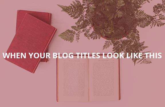
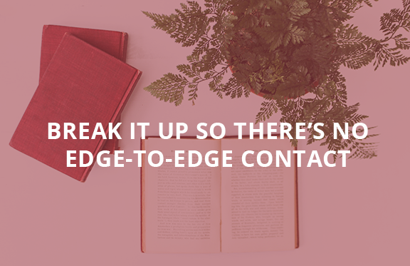
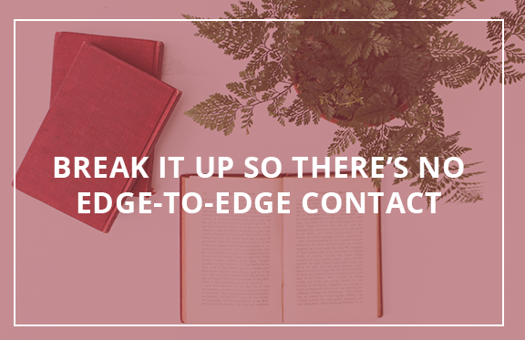
Pro tip: Don’t know where to break up your sentence? Try this read your sentence out loud and find the pause. From the example above, it makes more sense to move “edge-to-edge contact” be on the next line as opposed to “to-edge contact.”
3. Beware of script fonts.
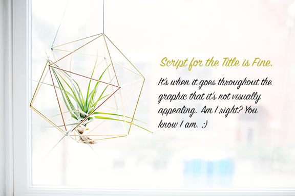
Script fonts are more difficult to find that doesn’t look dated or isn’t hard to read. When I do use them, it’s a secondary font, not the main choice. If you use script fonts are part of your brand, have a strong sans serif (ex. Open Sans) font to use for graphics for readability.
4. Use your weights.
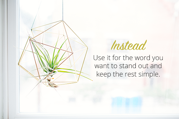
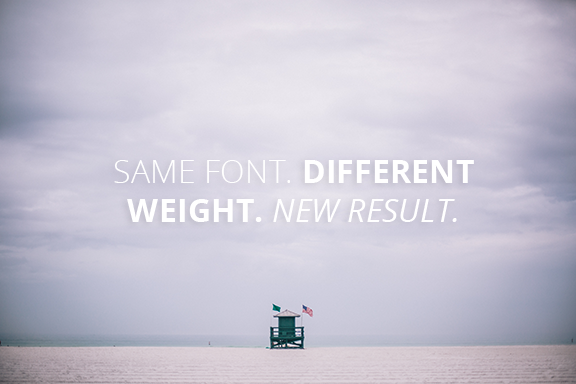
Are you stuck trying to combine fonts? Don’t waste your time font hunting. Instead, focus on one font, up to three weights. From here, you created three different fonts from the same font, which can do magic. When I do this, I don’t combine other fonts as it looks to be too much (if I don’t, I don’t use more than two fonts for a graphic-three at the absolute most).
5. Edit Your Stock Photos
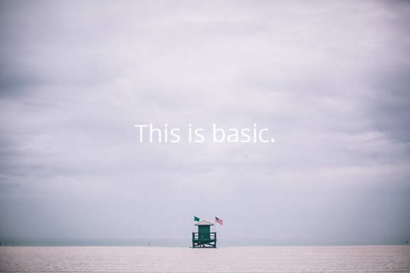
I don’t do this because the photos are bad, I do it to give them a different look. Given that using stock photos have surged greatly (and for great reason), you’ll notice quite a few using the same ones. Take the opportunity to be a bit creative with them.


Simple and quick right? How else have you stepped up your graphic game?
Until next time, C