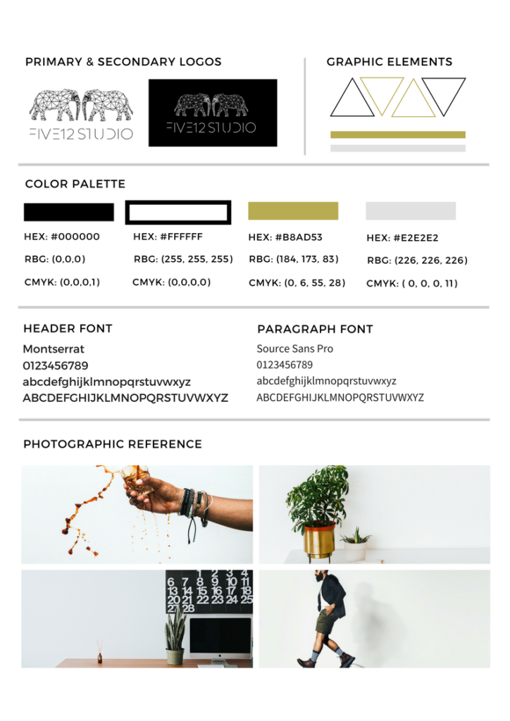
Do you have a style guide?
If you asked, “a what?” you’re in the right place.
A style guide is a document that contains how and what fonts, colors, logos, and imagery for your brand is used.
A lot like branding guidelines except it doesn’t include the why, how, mission, or vision statements.
Style Guides are essential because it helps you keep track of your style and makes onboarding a smoother process. Instead of guessing what yellow it is, you have the exact shade of yellow in front of you.
For example, you hire someone to design your website. A style sheet helps your designer know what fonts and colors to use so your branding stays consistent. If they need to pull in stock images for the site, the style of imagery will help them help you pull it all together.
Even if you’re DIYing your design, you need a style guide to help you stay on track.
Now let’s break down what you need on the style guide.

Style Guide Need: Fonts
List the fonts and how they are used.
For example, Montserrat is used for headings (H1-H6). Blog titles and any text I need to stand out will have this font.
Source Sans Pro is for the paragraph/body and meta tags.
The weight of your fonts should also be indicated, so for my brand, I’d specifically say Montserrat normal so bold isn’t used instead.
Need help choosing fonts? Here are a few suggestions!
Style Guide Need: Colors
As a designer, hearing, “Oh I have blue in my brand,” sends me into a panic. There are TONS of blues in the blue spectrum…which one do I use? Have the CMYK, RGB, and Hex numbers listed.
CMYK is used for print production. If you send something to a printer, you want to make sure your document switches these values so they stay as close as possible.
RGB is the way colors show on web/mobile devices. It uses red, green, and blue values to display colors.
Hex numbers (or hexadecimal) uses sixteen distinct symbols, 0–9 to represent values zero to nine, and A, B, C, D, E, F to represent values ten to fifteen. They mimic the code that RGB numbers makeup and are also web-friendly. For more, read here.
If you have one but not the other, color.adobe.com and HTML color codes are great tools to use to gather your information.
Style Guide Need: Logo Usage
Is there a time to use a stacked version? What about icons? What’s the biggest no-no for using your logo? Don’t assume everyone will “know” how your logo should look. I have horror stories of how a printing company stretched out a logo for a company I was working with. The conversation wasn’t pretty.
Style Guide Need: Design Elements
Lines, circles, triangles, scribbles…whatever element should be included. Like everything else, detail how and when to use each element and where to access them or how to create them is needed for your brand
Style Guide Need 5: Imagery
Sometimes for web design, I’ll use stock images if I’m waiting for updated images from the client. Knowing my client’s’ style helps me pick up the right images so they can view their site as if it’s something they would choose. Note: if a clients’ imagery looks like a traditional stock image photos, I’ll consult with them and make sure it fits their industry and target audience.
Now you need to organize all of this so it’s easy to share.
Once you’re finished, screenshot your template in the comments below!


