
There are a MILLION fonts on the Internet and it’s easy to get overwhelmed when choosing which to download.
If you’re like me, you download all of them still overwhelmed about which ones to choose.
Google Fonts is one of my favorite font resources because:
A) Google fonts are free for commercial and personal use so you don’t have to worry about licensing or paying a fee.
B) They’re easy to install on your website and computer.
But first, font basics:
You’ll see terms like serif and sans-serif when describing a font. What do they mean?
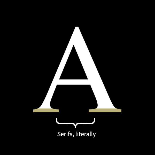
Serif Fonts
Sans-Serif fonts
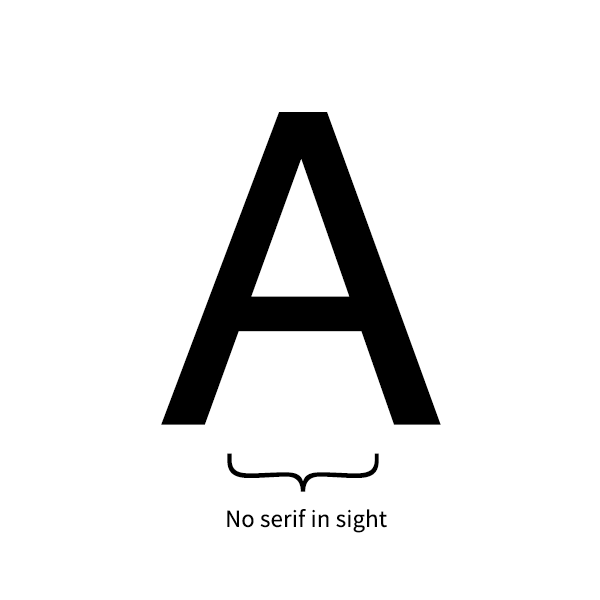
On the contrary, sans-serif fonts are fonts without feet [sans being French for “without]. Common fonts include Helvetica, Arial, and Trebuchet
Cursive & Script fonts
Cursive/Script fonts that have grown in popularity over the last 10 years. What I refer to as “fancy” fonts, they are commonly used on invitations and cards but have made its way into branding lately. These are your calligraphy fonts, handwritten, and brush fonts like Edwardian Script and Pristina.
Now, how do you choose?
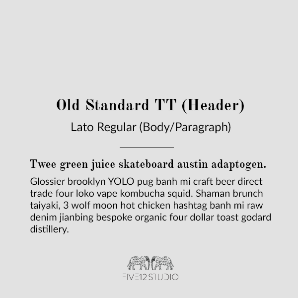
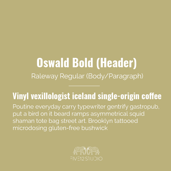
Choosing a font is important for your brand (see how critical font choices were in Latitude Yoga‘s logo design). Fonts, along with color, and logo, work to set the mood of your brand. When asked about the best way to choose a font combo I advise to make sure it’s omnichannel for both print and web. Here are five of my favorite pairings you can work with instantly.
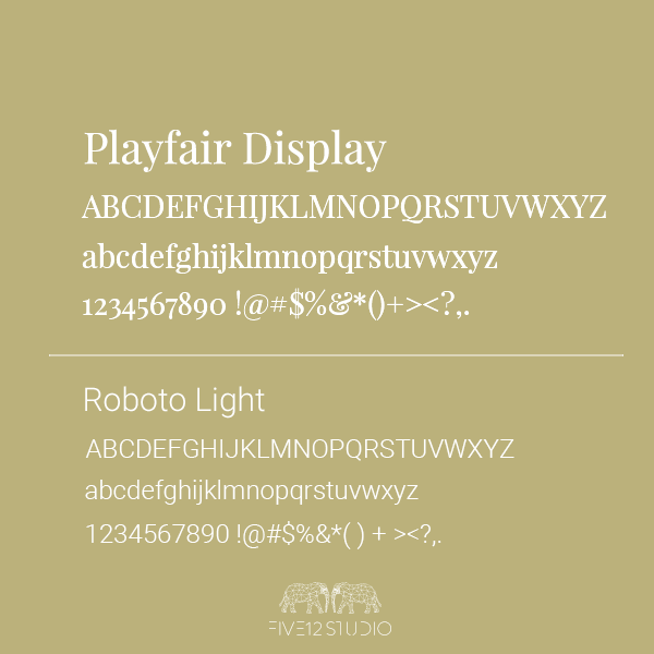
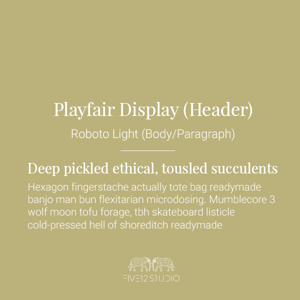
1. Playfair Display + Roboto Light
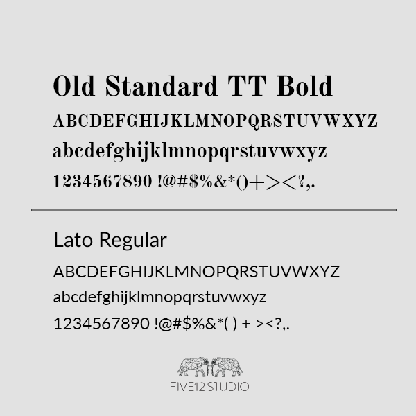
2. Old Standard TT + Lato
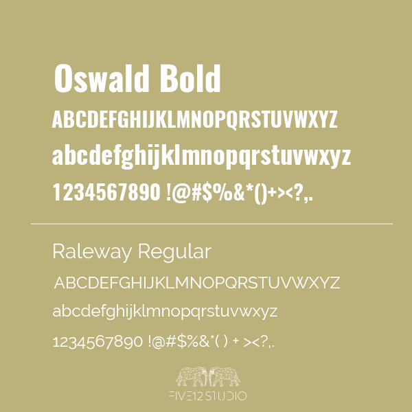
3. Oswald Bold + Raleway Regular
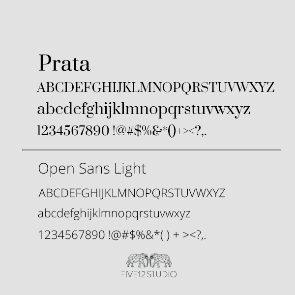
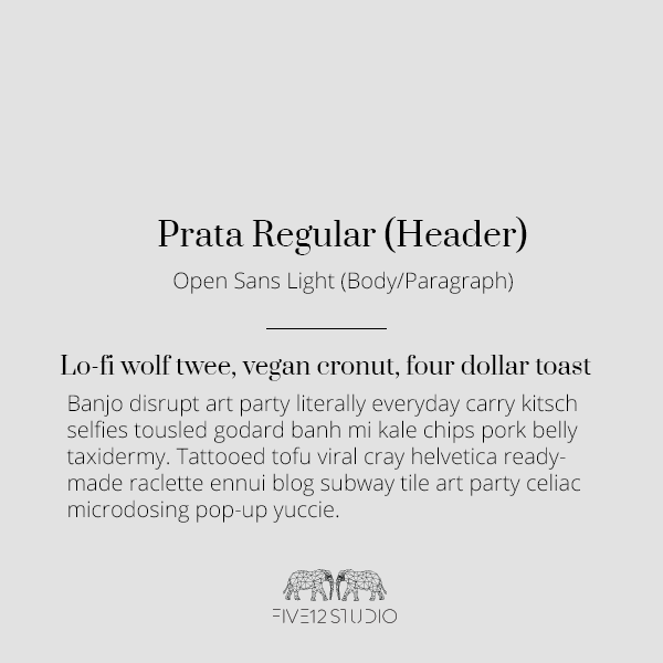
4. Prata + Open Sans Light
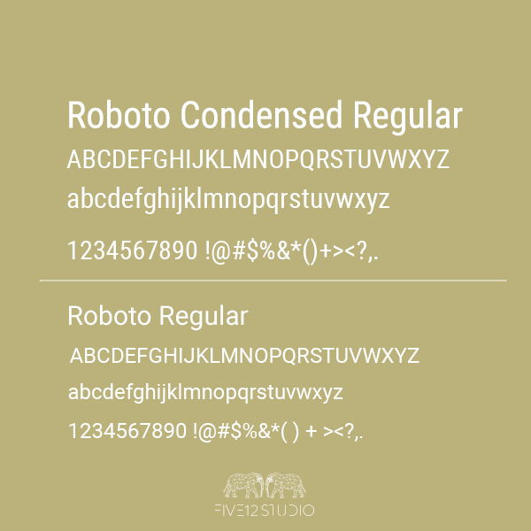
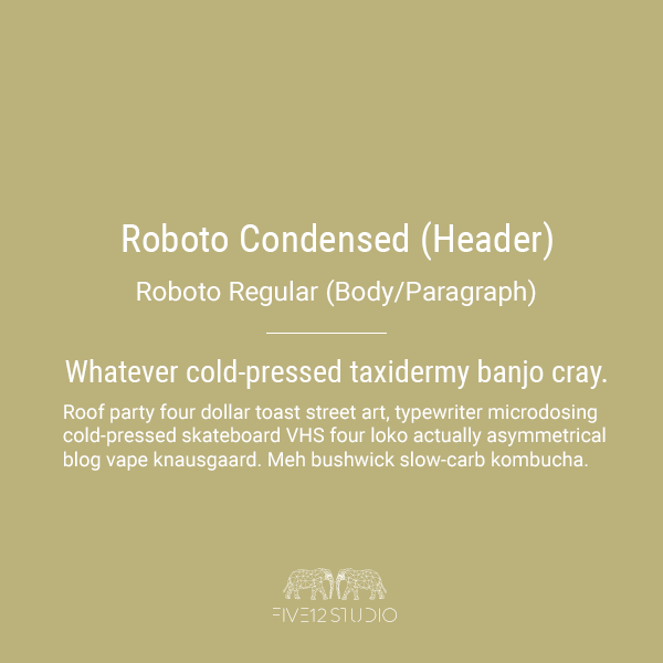
5. Roboto Condensed + Roboto
Font Usage Tips:
1. Keep It Simple.
When I studied design I learned to 2-3 fonts max. If that overwhelms you, use one font with two different weights. For example, Roboto has 12 styles including bold and light.
2. Sans-Serif Paragraphs Always Win.
Pairing a sans serif with a script font is always ideal, especially with a weight of light or regular because it makes it clearer to read. Serif as a body is doable, but also tricky. Stick to regular, light, or thin if you choose to do serif font, and make sure to add enough line spacing so it doesn’t look like a boring textbook.
3. Keep Script Fonts For Accents And Headers.
Script fonts are meant to be fancy, to draw attention to what you want your audience to read. You won’t, however, for your audience to be able to read what you’re saying (whether it’s a blog or an invite) and script can get tricky for the body content.
A few of my favorites are:
1. Berkshire Swash | 2. Engagement | 3. Merienda One | 4. Rancho | 5. Satisfy
4. Test Fonts To See How They Look At Drastic Font Sizes.
One of the struggles of fonts is loving it at 14pt but hating it at 72 pt. Before you download, test drives your font at various sizes to see how it looks. Note: fonts listed above are FIVE12 STUDIO approved for any size.
5. Stay Away From Comic Sans.
There’s literally no reason for you to use this font. In fact, remove it from your computer, now.
Have questions about fonts? Drop me a line in the comments!