
404-page error pages can be very boring.
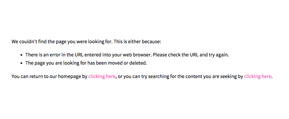
Pretty basic huh? It doesn’t grab your attention, it doesn’t offer anything but some boring wording. I don’t know about you, but I hate boring.
And that’s why I’m going to teach you how not to be boring.
Error pages lately have been more fun and creative. You can have a cheeky message or something cute and adorable that lessons the *ping* of stumbling upon a broken link.
Four oh Seven
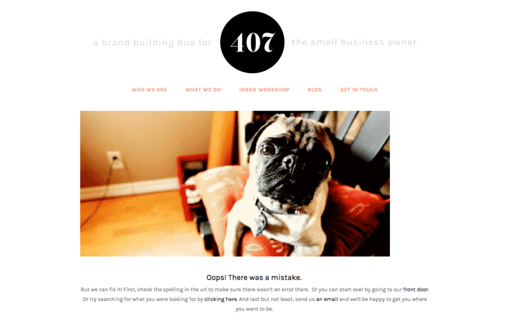
If you’re a Squarespace user, you’re in luck. Creating a 404 is super simple without needing a single piece of CSS/HTML code* so it’s as easy as eating pie.
(*if you used CSS/HTML to alter your page, or you want to alter this page to hide your header or navigation, you’ll need to use that code to do so. If not, keep reading like this doesn’t exist)
Technically, you can select any page to work as your 404 Error Page, but I highly recommend creating a separate page that will always work, using a new page or cover page.
To get started
-
Go to the homepage and select pages.
-
Select the plus sign (+) to select a new page or cover page.
If you’re using a new page
-
(Again, I strongly suggest making this page an opt-in, however, you don’t have to)
-
Create copy that’s a little fun and cheeky like: “OOPS! Looks like we hit a snag? Try again! And while you’re at it, sign up for the newsletter of all newsletters.”
-
Add an image, video, opt-in form or newsletter block.
-
Save.
If you’re using ‘cover pages’
-
If you’re using a cover page:
-
Select the template you want.
-
Edit the wording for each section you want.
-
Under ‘action,’ create a button that will link back to your homepage, blog or both.
-
Create your opt-in using the “form” block.
-
Change the font, photo, color scheme, etc, to fit your color scheme.
-
Save.
Now that it’s set, let’s move to the next step!
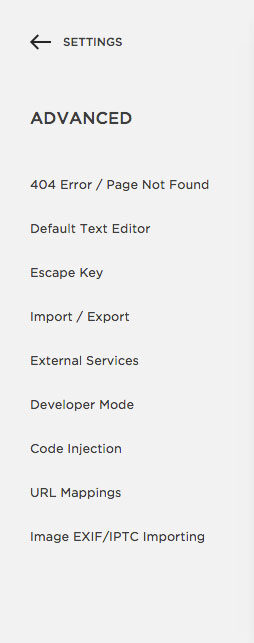
Go to Advanced
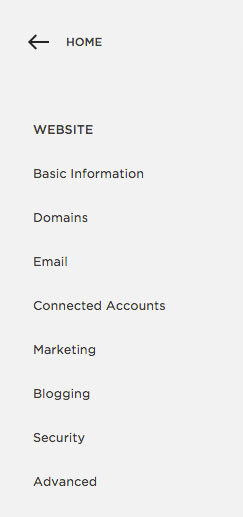
Go to Website
Select 404 Error Page
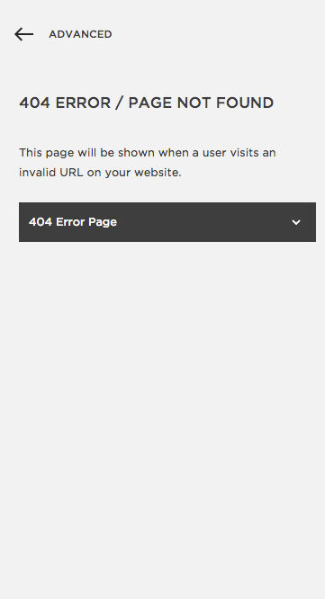
Use the dropdown menu to find the page you created.
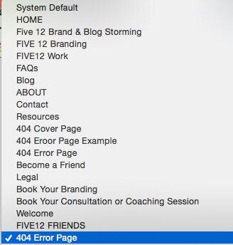
Batta boom, Batta bing. You’re done. That’s it. You’re gold. See how easy that was.
Tip: Add anything to your 404 page, but use this opportunity to allow people to opt-in!
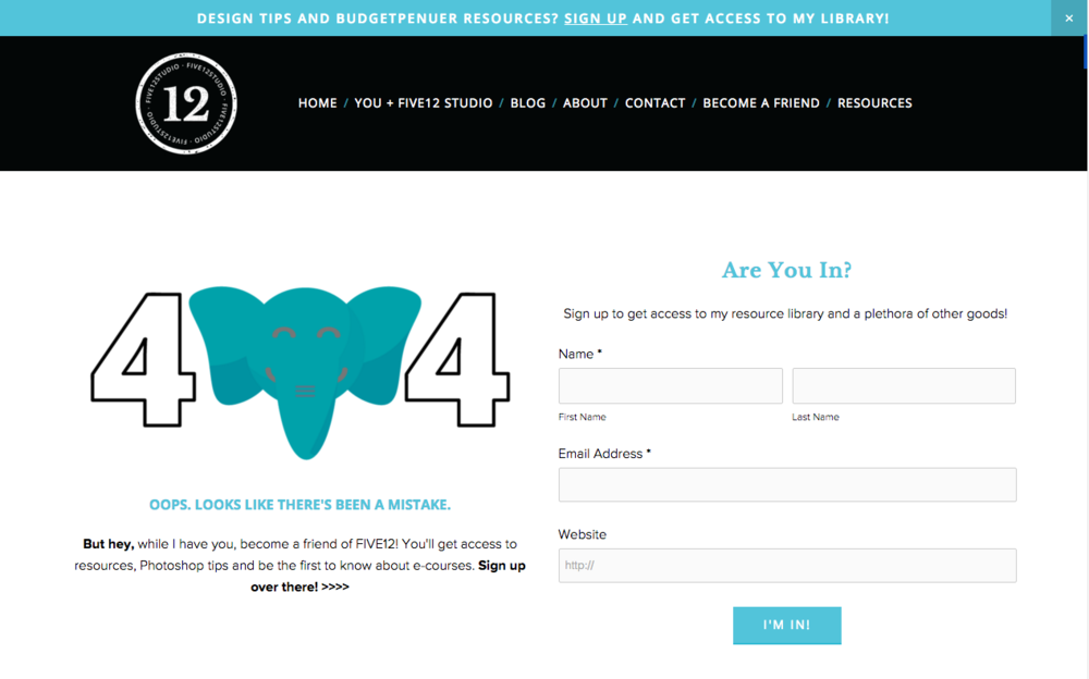
Need some more inspiration? Here are how other Squarespace users designed theirs:
Melanie Craft & CO
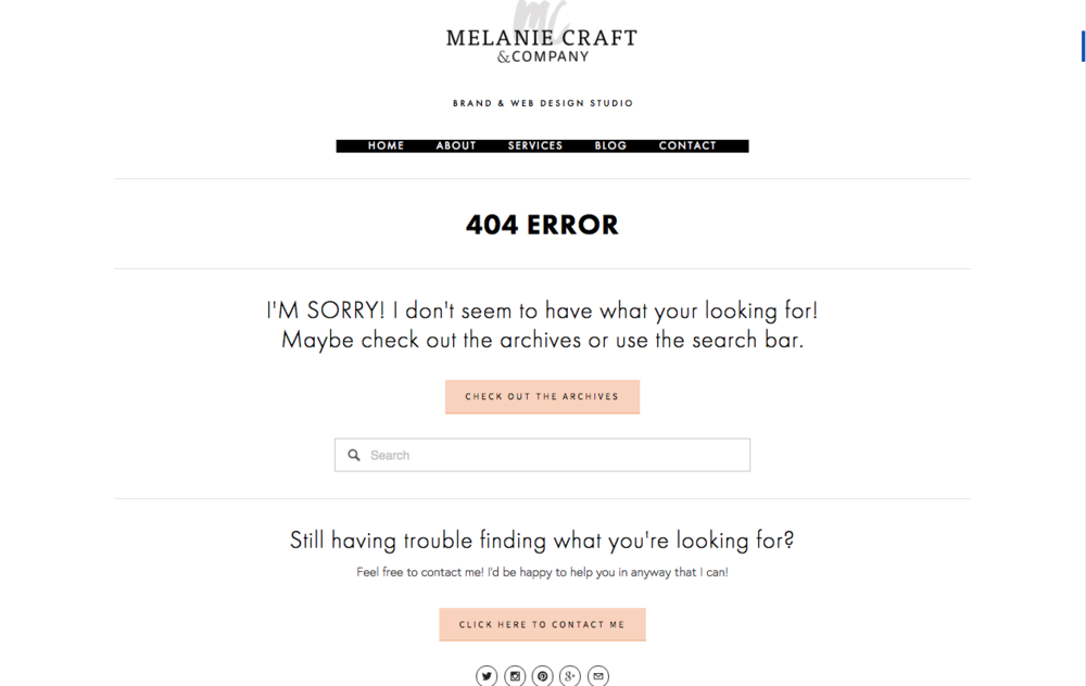
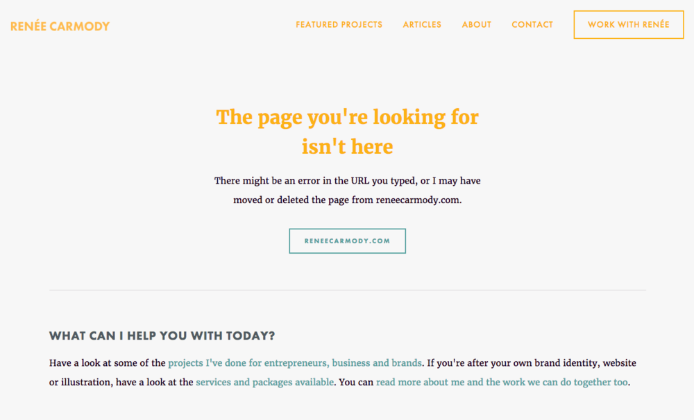
Renee Carmody
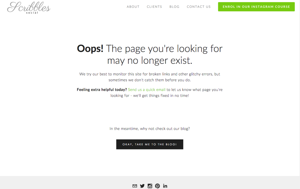
Scribbls Social
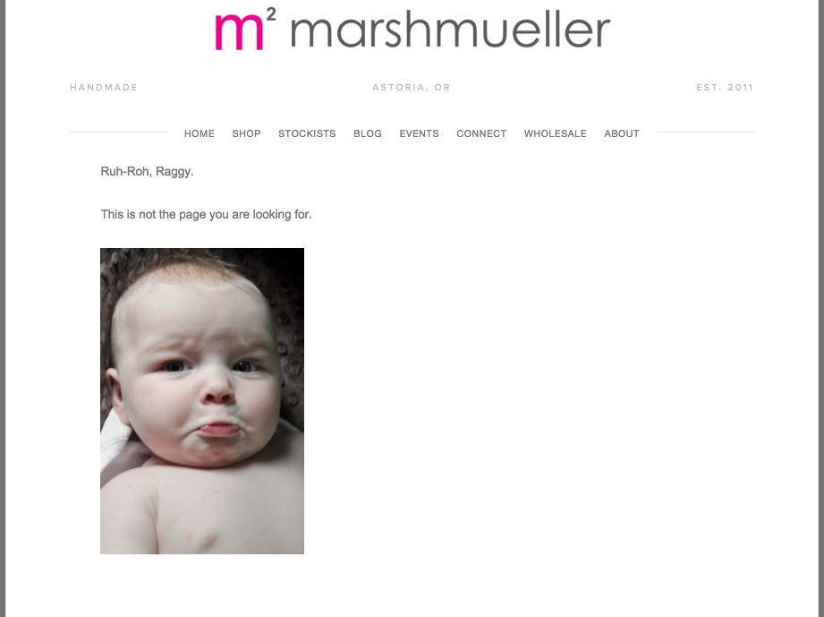
Marsh Muller
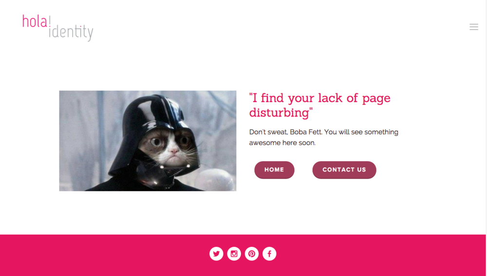
hola! identity
Now it’s your turn. Change your basic into something great and let me know in the comments!
Until next time, C


